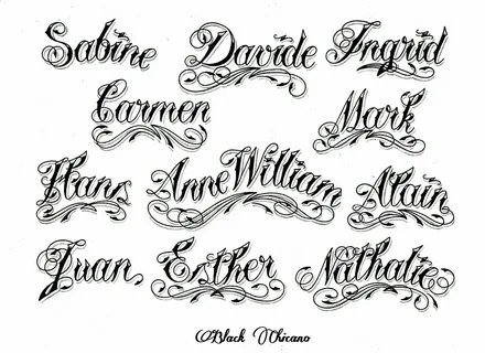
In the world of visual communication, fonts are the silent shapers of meaning. They go beyond mere readability, acting as powerful tools to evoke emotions, guide comprehension, and ultimately, connect with your audience on a deeper level. While understanding broad styles like serif and sans-serif provides a foundation, the true magic lies in exploring the nuances within each category. Let’s delve into the fascinating realm of fonts style, unlocking their hidden potential and empowering you to craft communication that resonates.
Beyond Labels: Unveiling the Spectrum Within Styles
Imagine serif fonts as a vast library of classic literature. While all serifs share a sense of tradition, exploring further reveals distinct personalities:
- Garamond: Elegant and refined, Garamond evokes a sense of timeless sophistication, making it perfect for academic publications or wedding invitations.
- Bodoni: With its sharp serifs and high contrast, Bodoni exudes a touch of formality and drama, ideal for fashion advertisements or luxury product branding.
- Times New Roman: This familiar workhorse offers a sense of neutrality and professionalism, making it a popular choice for business documents or legal contracts.
Sans-serif fonts, known for their clean lines, also offer a spectrum of personalities:
- Helvetica: This versatile font prioritizes readability and neutrality, allowing other design elements to shine. It’s a popular choice for websites, user interfaces, and branding across diverse sectors.
- Futura: With its geometric shapes and futuristic air, Futura evokes a sense of innovation and modernity, perfect for tech companies or product packaging with a forward-looking feel.
- Arial: A close relative of Helvetica, Arial offers a slightly more relaxed feel while maintaining excellent readability. It’s commonly used for educational materials or website content.
Even script fonts, known for their informality, showcase a range of emotions:
- Lucida Handwriting: Elegant and flowing, Lucida Handwriting injects a touch of personal warmth, making it ideal for invitations or greetings.
- Lobster: Playful and quirky, Lobster exudes a sense of fun and friendliness, perfect for children’s products or social media posts targeting a young audience.
- Pacifico: This casual script font with a beachy vibe evokes a sense of relaxation and vacation, making it ideal for tourism websites or summer promotions.
The Emotional Landscape of Font Styles: Going Beyond Readability
Each font style carries a subtle emotional weight, influencing how your audience perceives your message:
- Formal vs. Informal: Serif fonts like Garamond or Times New Roman project a sense of formality, while script fonts like Lucida Handwriting create a more informal and personal atmosphere.
- Serious vs. Playful: Fonts like Bodoni with their sharp edges can convey seriousness and authority, while playful script fonts like Lobster inject a touch of fun and lightheartedness.
- Traditional vs. Modern: Classic serif fonts like Garamond evoke a sense of tradition, while modern sans-serif fonts like Futura project a forward-looking and innovative feel.
Choosing the Right Font Style Nuance: A Strategic Selection Process
Selecting the perfect font style nuance hinges on understanding your communication goals:
- Brand Identity: If you have an established brand personality, choose a font style that aligns with your brand voice. A playful children’s clothing brand might choose a fun script font, while a serious financial institution might opt for a classic serif font.
- Target Audience: Consider who your message is reaching. For a younger audience, a lighthearted sans-serif or playful script font might grab attention. For a professional audience, a classic serif font might inspire greater trust.
- Content and Tone: Match the font style to the overall tone of your message. For a formal presentation, a bold sans-serif font might be appropriate, while a heartfelt letter might benefit from a flowing script font.
Beyond Selection: Optimizing Font Style Nuances for Impact
Using font styles effectively goes beyond just choosing the right one. Here are some additional tips:
- Hierarchy and Emphasis: Use variations within a style for hierarchy. Headlines in a bolder weight or a slightly different style can grab attention, while body text in a lighter weight ensures easy reading.
- Style Pairing: Carefully consider combining style nuances. For example, a classic serif font for the main text and a modern sans-serif font for a call to action can create a sense of balance and intrigue.
- Color Contrast and Accessibility: Ensure adequate contrast between the font color and the background color for readability, especially for users with visual impairments.
- Font Size and Readability: Always prioritize readability. Use font sizes appropriate for the chosen platform (web vs. print) and adjust the size based on the amount


